library("tidycensus")
library("tidyverse")

census_api_key("YOUR KEY HERE", install = TRUE, overwrite = TRUE)The struggle was real
There are many ways to access U.S. Census Bureau data. For years, I used data.census.gov to query data, download spreadsheets, and clean them in Excel. This process was tedious, inefficient, and quite frankly sucked.
Everything changed when I learned R and discovered the tidycensus package, created by Kyle Walker. Tidycensus uses the Census API to pull data directly into R in a tidy format, making analysis and visualization straightforward.
This post is a quick reference for getting started with tidycensus. Even if you’re new to R, this can be a great motivator to learn. I’ll by demonstrate pulling income data for Indiana’s 92 counties from the ACS data. For a more comprehensive guide, check out Walker’s book on the package.
Package Installation and API Key
In order to use tidycensus, you must first obtain an API key from the Census Bureau. You can request a key here and should receive it via email shortly.
Once you have an API key, you can install the package and set your key. My key will remain invisible in this post, but you should run the following code and fill in the placeholder with your own key if you are following along.
Note, I am also using the tidyverse package, which is my go-to for data wrangling and visualization.
View ACS variables
A huge benefit right off the bat is the ability to view all available variables in the ACS data. The code below will pull a list of all variables in the detailed ACS tables for the 2022 5-Year sample. A more in-depth guide to accessing the right variables for your project can be found here.
# load all variables for the 2022 ACS 5-Year sample
v22 <- load_variables(2022, "acs5", cache = TRUE)

# show the first 10 rows of the variables dataframe
head(v22)
I typically like to open up the varibles dataframe in RStudio’s viewer pane for easier searching. Here, I’ve searched for “median household income” and a ton of options popped up. It can be tricky to pick the right one. My best advice is to scroll over to the right and look at the “concept” column to see more details.

Variable B19013_001 has a concept description of “Median Household Income in the Past 12 Months (in 2022 Inflation-Adjusted Dollars)”, which sounds good.
An extra check that you have the right data is to pull that variable for the nation as a whole and compare to what you see on data.census.gov. Below, I’ve gone to the census website and searched for the “B19013” table and filtered for the 2022 5-Year ACS. The median household income for the U.S. in that year was $75,149

Let’s see what tidycensus says! The code below is a simple ACS pull for the variable we’ve identified.
# pull the median household income for the U.S. in 2022 (5-Year Sample)
us_income <- get_acs(
  geography = "us",
  variables = "B19013_001",
  year = 2022,
  survey = "acs5")

# print the results
us_income
Bingo. The numbers match. Now that we know we have identified the variable we want, let’s pull the data for Indiana’s 92 counties.
Pulling Indiana’s county-level data
Using the same get_acs function, we can pull the median household income for Indiana’s counties in 2022. Notice in the code below that we are now using “county” for the geography argument and “IN” for the state argument.
If the state argument is left blank, the function will pull data for counties nationwide, which can be useful but not necessary for this example.
# pull the median household income for Indiana's 92 counties in 2022 (5-Year Sample)
in_income <- get_acs(
  geography = "county",
  variables = "B19013_001",
  state = "IN",
  survey = "acs5",
  year = 2022)

# show the 10 highest income counties
in_income %>% arrange(desc(estimate))
We can see that Hamilton County had the highest median household income in Indiana in 2022, followed by Boone and Hendricks counties.
Visualize the data
At this point, we can do all sorts of things to visualize the data. Perhaps you’d like to see a histogram of household income.
# create a histogram of Indiana's county-level median household income
in_income %>%
  ggplot(aes(x = estimate)) +
  geom_histogram(bins = 20, fill = "skyblue", color = "black") +
  labs(title = "Median Household Income Distribution",
       subtitle = "Indiana Counties",
       caption = "2022 5-Year ACS",
       x = "Median Household Income",
       y = "Count") +
  theme_minimal()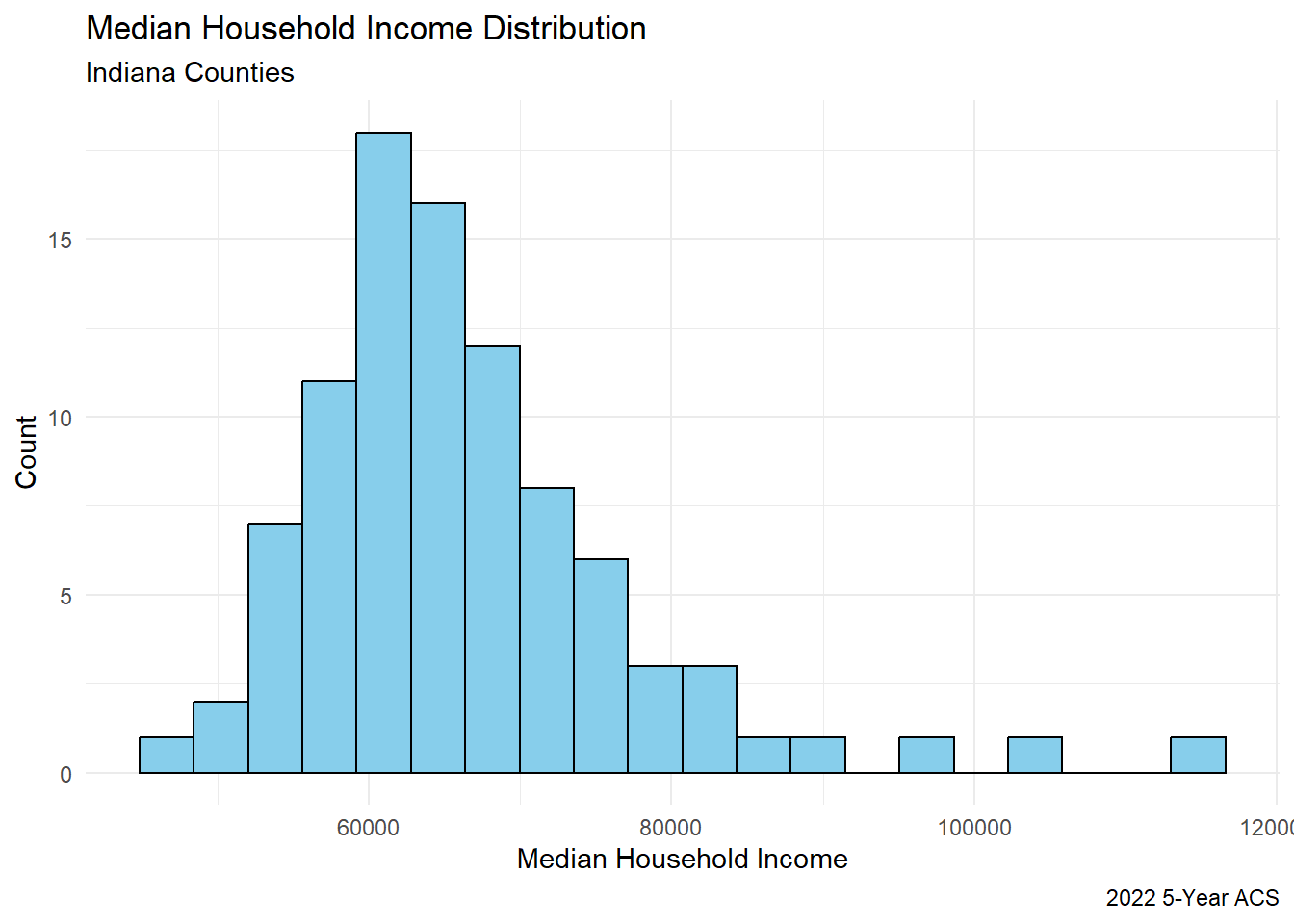
Hamilton and Boone counties are clear outliers in the data when it comes to income. The median clusters around $60K.
Mapping the data
Or maybe you’d like to see the data on a map. In order to prep the data for mapping, all we need to do is re-run the get_acs function with the geometry = TRUE argument. This will pull the spatial data for the counties in Indiana.
Now that we have the spatial data, we can map the median household income for Indiana’s counties.
# make a map
in_income_geo %>%
  ggplot(aes(fill = estimate)) +
  geom_sf(color = "white") +
  scale_fill_viridis_c() +
  labs(title = "Median Household Income",
       subtitle = "Indiana Counties",
       caption = "Source: American Community Survey") +
  theme_void()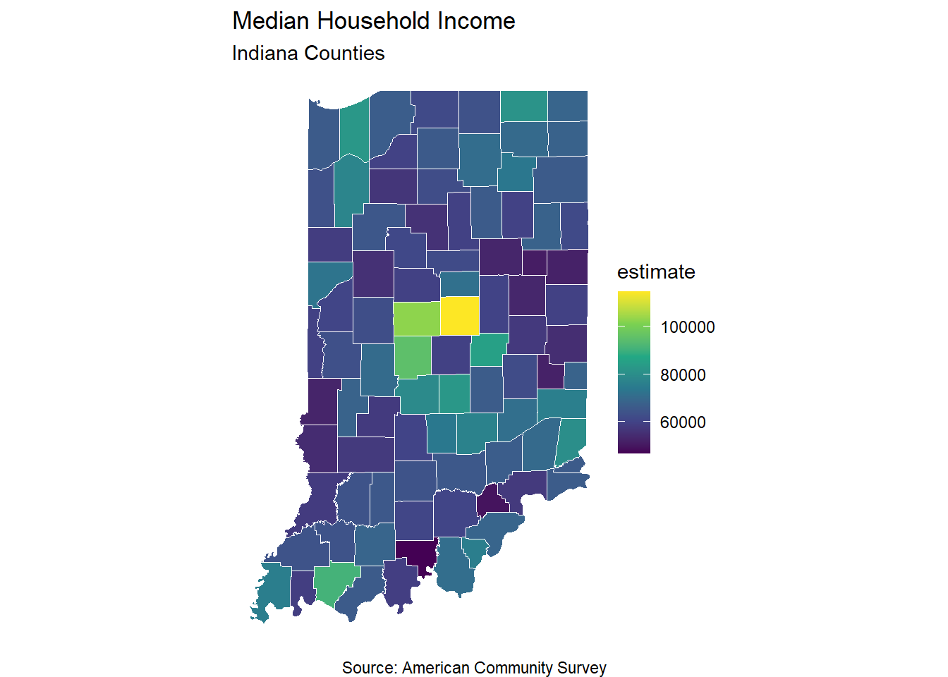
If you’ve tried to make maps in one of various softwares before, you should see the incredible value of this workflow. With just a few lines of code, I’ve generated a clean map.
But there’s more!
Make the map interactive
Using the mapview package, this map can be quickly made interactive. Again, if you’ve mapped before, the efficiency here is truly remarkable.
# make an interactive map
library("mapview")

in_income_geo %>%
  mapview::mapview(zcol = "estimate", layer.name = "Median Household Income($))")
That’s it. A few more simple lines of code and you have an interactive map.
Other tidycensus capabilities
Pull data over time
In addition to grabbing an ACS estimate for a single variable for a single year, tidycensus can also pull data over time. Below, I’ve pulled the median household income for Marion County, Indiana from 2012 to 2022.
This requires writing a loop using map_dfr from the purrr package. The map_dfr function is helpful to combine the results of each iteration into a single dataframe.
Don’t be scared. Once you have the loop written once you can modify and reuse again and again.
# pull median household income for Marion County, Indiana from 2012 to 2022
# NOTE: 2020 single year ACS estimates were not released due to the pandemic

# specify years
years <- c(2012:2019, 2021:2022)
names(years) <- years

# run the loop
income_by_year <- map_dfr(years, ~{
  get_acs(
    geography = "county",
    variables = "B19013_001",
    state = "IN",
    county = "Marion",
    survey = "acs1",
    year = .x
  )
}, .id = "year")

# make a line graph of the data
income_by_year %>%
  ggplot(aes(x = year, y = estimate, group = 1)) +
  geom_line(color = "skyblue") +
  labs(title = "Median Household Income Over Time",
       subtitle = "Marion County, Indiana",
       caption = "Source: American Community Survey",
       x = "Year",
       y = "Median Household Income ($)") +
  theme_minimal()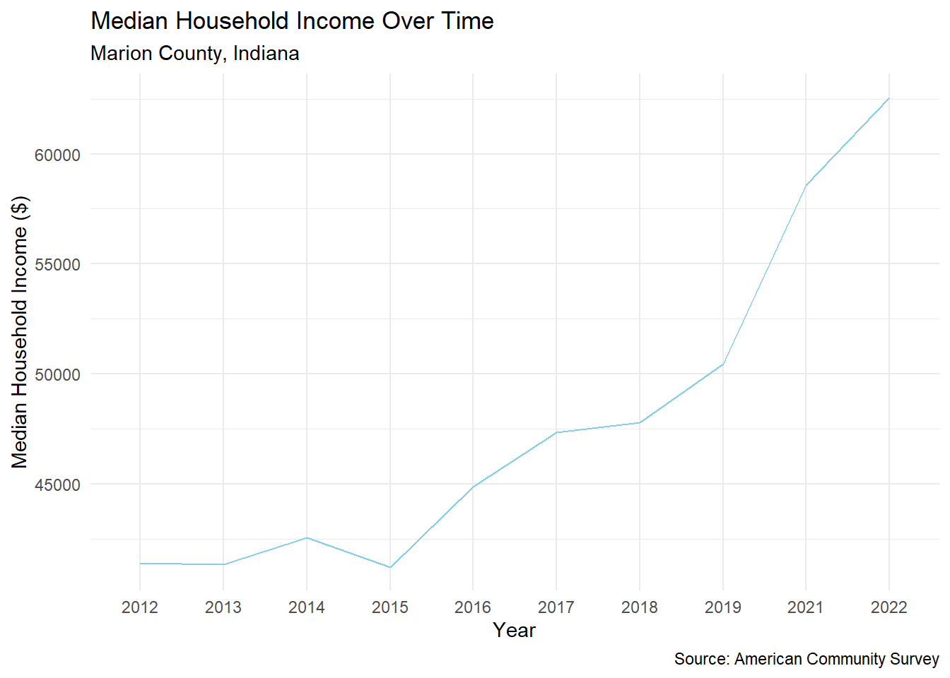
NOTE: median household income is not adjusted for inflation
Pull data for small-area geographies
Tidycensus supports geographic subsetting, meaning that you can pull data for a certain geography that is contained within a larger geography. For example, you could get median household income for all census tracts within Marion County.
That example is below, with the geometry argument set to “TRUE” required for mapping.
Now let’s map the results!
# make a map
marion_income %>%
  ggplot(aes(fill = estimate)) +
  geom_sf(color = "white") +
  scale_fill_viridis_c() +
  labs(title = "Median Household Income",
       subtitle = "Marion County, Indiana",
       caption = "Source: American Community Survey") +
  theme_void()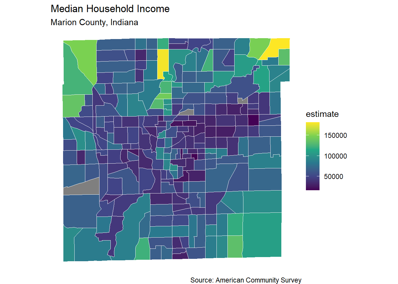
Pull multiple variables at the same time
Typically when working through geographic analysis with Census data, you will want to have access to more than just one variable. Yet again, tidycensus makes this easy.
Below I have pulled the median household income and the percentage of households with broadband internet access for census tracts in Marion County, Indiana in 2022.
Notice the argument output = "wide" in the get_acs function. This argument allows for variables to be split out into multiple columns, making the next step easier.
# pull median household income and percentage of households with broadband internet access for Marion county, Indiana in 2022

marion_vars <- c("B19013_001", "S2801_C02_014")

marion_vars_data <- get_acs(
  geography = "tract",
  county = "Marion",
  state = "IN",
  variables = marion_vars,
  survey = "acs5",
  output = "wide",
  year = 2022
)
With both of this variables pulled, perhaps you’d like to see the geographic relationship between the two. That can easily be done with a scatter plot.
# make a scatter plot of the two variables
marion_vars_data %>%
  ggplot(aes(x = B19013_001E, y = S2801_C02_014E)) +
  geom_point(color = "skyblue") +
  labs(title = "Income vs. Broadband Access",
       subtitle = "Marion County, Indiana",
       caption = "Source: American Community Survey",
       x = "Median Household Income ($)",
       y = "Households with Broadband (%)") +
  theme_minimal()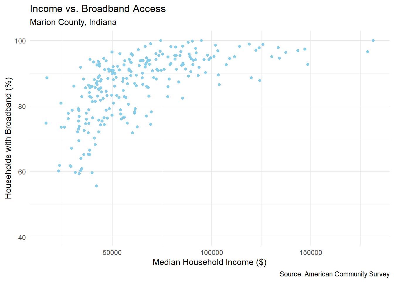
There’s so much more you can do. But hopefully this has piqued your interest.