Load packages and set up API key
library("tidycensus")
library("tidyverse")
library('hrbrthemes') # to make the plots pretty :)
library("sf")
library("tigris")

census_api_key(Sys.getenv("TIDYCENSUS_KEY"), install = TRUE, overwrite = TRUE)December 14, 2024
Analyzing population growth over time is a common task in demographic analysis. It can be more complex than it seems, particularly at municipal level where city borders can change quite frequently.
Fortunately, R has a series of packages that can help navigate these challenges. This post details how I approach boundary changes in population analysis, using tidycensus, sf and tigris analyzing Kokomo, Indiana as an example.
The analysis in this post uses the tidycensus R package heavily. To learn more about how to set up and use that package, check out my blog post on it here. To view the code behind the analysis, click the dropdowns throughout the post.
According to the most recent decennial Census, Kokomo, Indiana’s population grew from around 45K in 2010 to over 59K in 2020. That seems significant and worth investigating, especially for a small city whose population had hovered between 44K and 47K since the 1960’s.
Let’s turn to tidycensus.
Figure 1 shows the significant increase in the city’s population between 2010 and 2020. The most logical follow-up is to see whether there is a jump in any particular year, or if the change was more gradual.
# Get population of Kokomo, Indiana in 2000 using get_decennial
pop_2000 <- get_decennial(geography = "place",
                          variables = "PCT012001",
                          state = "IN",
                          year = 2000) %>%
  filter(
    NAME == 'Kokomo city, Indiana'
  )

# Get population of Kokomo, Indiana in 2010 using get_decennial
pop_2010 <- get_decennial(geography = "place",
                          variables = "P001001",
                          state = "IN",
                          year = 2010)  %>%
  filter(
    NAME == 'Kokomo city, Indiana'
  )


# Get population of Kokomo, Indiana in 2020 using get_decennial
pop_2020 <- get_decennial(geography = "place",
                          variables = "P1_001N",
                          state = "IN",
                          year = 2020) %>%
  filter(
    NAME == 'Kokomo city, Indiana'
  )


# Combine the three data frames into one
kokomo_pop_data <- bind_rows(pop_2000, pop_2010, pop_2020)

# add a column for the year
kokomo_pop_data$year <- c(2000, 2010, 2020)


# Plot the population of Kokomo over time in a bar chart
ggplot(kokomo_pop_data, aes(x = year, y = value)) +
  geom_bar(stat = "identity", fill = 'dodgerblue') +
  labs(title = "Population of Kokomo, Indiana",
       subtitle = "2000, 2010, and 2020 Decennial Census",
       x = "Year",
       y = "Population") +
  theme_ipsum() +
  theme(axis.text.x = element_text(hjust = 1)) +
  scale_y_continuous(labels = scales::comma, limits = c(0, 62000)) +
  geom_text(aes(label = scales::comma(value), y = value), vjust = -0.5)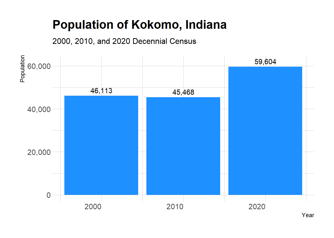
The year-over-year change in population is shown in Figure 2. No doubt about it, 2012 is an outlier. The population increased by over 8,000 people in one year, compared to less than 1,300 in every other observation in this data set.
ACS population estimates (particular the 5-Year sample) like the ones below aren’t the most precise population estimates put out by the Census Bureau, they work well enough to show general trends. The 1-Year sample is not available for Kokomo, as it only covers geographies with a population of 65,000 or greater.
# get annual population estimates for Kokomo
years <- c(2010:2022)
names(years) <- years

kokomo_by_year <- map_dfr(years, ~{
  get_acs(
    geography = "place",
    variables = "B01001_001",
    state = "IN",
    survey = "acs5",
    year = .x
  )
}, .id = "year") %>%
  filter(
    NAME == 'Kokomo city, Indiana'
  )

# calculate year over year change in population as a new column
kokomo_by_year <- kokomo_by_year %>%
  mutate(
    pop_change = estimate - lag(estimate),
    pop_change_pct = (estimate - lag(estimate)) / lag(estimate) * 100
  )


# plot a line chart of the pop_change
ggplot(kokomo_by_year, aes(x = year, y = pop_change, group = 1)) +
  geom_line(color = 'dodgerblue') +
  geom_point(color = 'dodgerblue') +
  labs(title = "Year over Year Population Change",
       subtitle = "Kokomo, Indiana",
       x = "Year",
       y = "Population Change") +
  theme_ipsum() +
  scale_y_continuous(labels = scales::comma, limits = c(-300, 9000)) +
  geom_text(aes(label = scales::comma(pop_change), y = pop_change), vjust = -0.5) +
  scale_x_discrete(breaks = seq(2010, 2022, 2))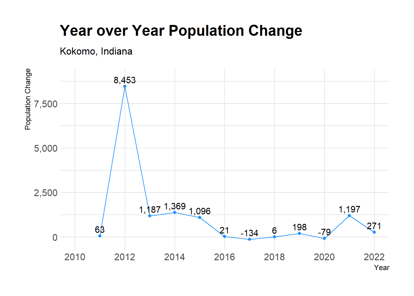
Based on the data so far, it appears Kokomo’s boundaries may have changed around 2012, resulting in annexation of new land and a population increase. To confirm this, I used the tigris package to map the city’s boundaries over time. The map below shows Kokomo’s city limits each year from 2014 through 2020 layered on top of one another.
When I attempted to include years before 2014, the tigris package told me that the boundaries were not available for those years. I will address that by importing shapefiles downloaded from the Census website for those specific years later in the post.
There are certainly more elegant ways to write the code below, but in the spirit of the “Make it Work. Make it Right. Make it Fast.” mantra, this code sits firmly in the “Make it Work” bucket.
# get kokomo boundaries in 2020
kokomo_2020 <- places(cb = TRUE, year = 2020) %>%
  filter(str_detect(NAMELSAD, "Kokomo city"))

# write a loop to get kokomo boundaries for each year from 2013 to 2020
kokomo_boundaries <- map_dfr(2014:2020, ~{
  places(state = "IN", cb = TRUE, year = .x)
}, .id = "year") %>%
  filter(str_detect(NAME, "Kokomo"))

# Add the correct 'year' column
kokomo_boundaries <- kokomo_boundaries %>% mutate(year = rep(2014:2020, each = nrow(kokomo_boundaries) / 7))

# kokomo census tracts in 2020
kokomo_2020_tracts <- tracts(state = "IN", county = "Howard", year = 2020)

# split the kokomo_boundaries file into dataframes of each year of the data
kokomo_boundaries_2019 <- kokomo_boundaries %>%
  filter(year == 2019)
kokomo_boundaries_2018 <- kokomo_boundaries %>%
  filter(year == 2018)
kokomo_boundaries_2017 <- kokomo_boundaries %>%
  filter(year == 2017)
kokomo_boundaries_2016 <- kokomo_boundaries %>%
  filter(year == 2016)
kokomo_boundaries_2015 <- kokomo_boundaries %>%
  filter(year == 2015)
kokomo_boundaries_2014 <- kokomo_boundaries %>%
filter(year == 2014)# plot the city limits
# add a background map
kokomo_lims <- ggplot() +
geom_sf(data = kokomo_2020_tracts, fill = NA, color = "grey") +
geom_sf(data = kokomo_2020, fill = NA, color = "red") +
geom_sf(data = kokomo_boundaries_2019, fill = NA, color = "blue") +
geom_sf(data = kokomo_boundaries_2018, fill = NA, color = "green") +
geom_sf(data = kokomo_boundaries_2017, fill = NA, color = "purple") +
geom_sf(data = kokomo_boundaries_2016, fill = NA, color = "orange") +
geom_sf(data = kokomo_boundaries_2015, fill = NA, color = "brown") +
geom_sf(data = kokomo_boundaries_2014, fill = NA, color = "black") +
# geom_sf(data = kokomo_boundaries, aes(fill = year), color = "black") +
theme_void()
# add a title to the map
# add a legend showing that the 2014 boundaries are in black and the 2015-2020 boundaries are in red
kokomo_lims + labs(title = " Kokomo City Limits 2014-2020",
subtitle = ' 2014 boundaries in black; 2015-2020 in red',
caption = 'Howard County Census tracts in grey ')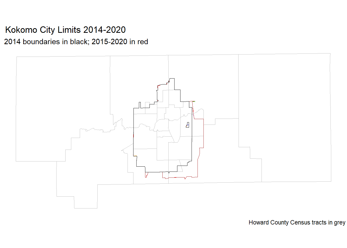
The boundaries for 2014 are show in black, and the boundaries for years 2015-2020 are showing in red. You can clearly see that between 2014 and 2015, the city expanded to the east and south. However, this expansion doesn’t appear to have pulled in a significant population addition.
Next, I imported shapefiles for Kokomo’s city limits for years before 2014. These files were downloaded from the Census Bureau TIGER Shapefiles website. I used the sf package to read in the shapefiles and plot them with the previously shown boundaries.
# read in shapefiles for Kokomo's city limits for years before 2014
# 2013
kokomo_boundaries_2013 <- st_read("tl_2013_18_place//tl_2013_18_place.shp")
kokomo_boundaries_2013 <- kokomo_boundaries_2013 %>%
filter(str_detect(NAME, "Kokomo"))
# 2012
kokomo_boundaries_2012 <- st_read("tl_2012_18_place//tl_2012_18_place.shp")
kokomo_boundaries_2012 <- kokomo_boundaries_2012 %>%
filter(str_detect(NAME, "Kokomo"))
# 2011
kokomo_boundaries_2011 <- st_read("tl_2011_18_place//tl_2011_18_place.shp")
kokomo_boundaries_2011 <- kokomo_boundaries_2011 %>%
filter(str_detect(NAME, "Kokomo"))
# 2010
kokomo_boundaries_2010 <- st_read("tl_2010_18_place10//tl_2010_18_place10.shp")
kokomo_boundaries_2010 <- kokomo_boundaries_2010 %>%
filter(str_detect(NAME10, "Kokomo"))# plot the city limits
# add a background map
kokomo_lims <- ggplot() +
geom_sf(data = kokomo_2020_tracts, fill = NA, color = "grey") +
geom_sf(data = kokomo_2020, fill = NA, color = "red") +
geom_sf(data = kokomo_boundaries_2019, fill = NA, color = "blue") +
geom_sf(data = kokomo_boundaries_2018, fill = NA, color = "green") +
geom_sf(data = kokomo_boundaries_2017, fill = NA, color = "purple") +
geom_sf(data = kokomo_boundaries_2016, fill = NA, color = "orange") +
geom_sf(data = kokomo_boundaries_2015, fill = NA, color = "brown") +
geom_sf(data = kokomo_boundaries_2014, fill = NA, color = "black") +
geom_sf(data = kokomo_boundaries_2013, fill = NA, color = "darkgreen") +
geom_sf(data = kokomo_boundaries_2012, fill = NA, color = "black") +
geom_sf(data = kokomo_boundaries_2011, fill = NA, color = "dodgerblue2") +
geom_sf(data = kokomo_boundaries_2010, fill = NA, color = "dodgerblue2") +
theme_void()
# add a title to the map
kokomo_lims + labs(title = " Kokomo City Limits 2010-2020",
subtitle = ' 2010-2011 boundaries in blue
2012-2014 boundaries in black
2015-2020 in red',
caption = 'Howard County Census tracts in grey ')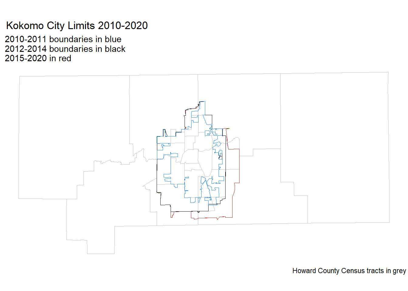
Bingo!
Just as the line chart of year-over-year population change showed, the city limits expanded significantly between 2011 and 2012, then expanded even further in 2015.
That increase of over 8,000 people in one year was likely due to annexation of new land, not a sudden population boom. As a double-check, some local news articles from the time confirm my initial suspicion.
So, what’s the solution? There are more advanced techniques that attempt to hold the geographic boundaries steady over time, but that’s outside the scope of this post. Additionally, you could lean on the Census Bureau’s population estimates program for more granular population change data.
A good alternative is to use either counties or county subdivisions (townships) to approximate the same area over time. Center Township in Howard County contains most of Kokomo. Here is the population over time for Center Township. Notice how stable it is.
# get annual population estimates for Center Township
years <- c(2010:2023)
names(years) <- years
center_by_year <- map_dfr(years, ~{
get_acs(
geography = "county subdivision",
variables = "B01001_001",
state = "IN",
survey = "acs5",
year = .x
)
}, .id = "year") %>%
filter(
NAME == 'Center township, Howard County, Indiana'
)# plot a line chart of center township
ggplot(center_by_year, aes(x = year, y = estimate, group = 1)) +
geom_line(color = 'dodgerblue') +
geom_point(color = 'dodgerblue') +
labs(title = "Center Township, Howard County",
subtitle = "Population over time",
x = "Year",
y = "Population") +
theme_ipsum() +
scale_y_continuous(labels = scales::comma, limits = c(0, 60000)) +
scale_x_discrete(breaks = seq(2010, 2023, 2))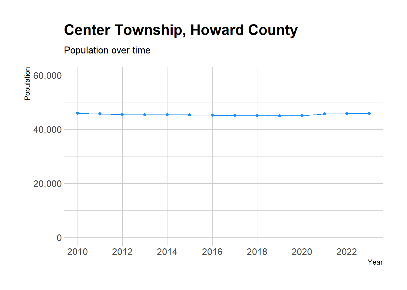
City boundaries change frequently. When looking at population change–or any metric that uses population as a denominator–it’s import to keep the possibility of annexation in mind.
The tidycensus, sf, and tigris packages are a powerful toolkit for ensuring the results of your analysis can be placed in the proper context.
---
title: "Annexation Station"
description: "Lookout for boundary changes when population totals jump"
author:
- name: Aaron Olson
url: https://github.com/marginofaaron
date: 12-14-2024
categories: [R, census] # self-defined categories
image: fig-kokomo-2010-2020-1.png
draft: false # setting this to `true` will prevent your post from appearing on your listing page until you're ready!
format:
html:
code-fold: true
code-tools: true
code-copy: true
execute:
warning: false
message: false
---
## Introduction
Analyzing population growth over time is a common task in demographic analysis. It can be more complex than it seems, particularly at municipal level where city borders can change quite frequently.
Fortunately, R has a series of packages that can help navigate these challenges. This post details how I approach boundary changes in population analysis, using [`tidycensus`](https://walker-data.com/tidycensus/index.html), [`sf`](https://r-spatial.github.io/sf/) and [`tigris`](https://github.com/walkerke/tigris) analyzing Kokomo, Indiana as an example.
::: {.callout-note collapse="true"}
The analysis in this post uses the `tidycensus` R package heavily. To learn more about how to set up and use that package, check out my blog post on it [here](https://aaroneolson.me/posts/2024-11-22-tidycensus-guide/). To view the code behind the analysis, click the dropdowns throughout the post.
:::
## Kokomo's Population Growth
According to the most recent decennial Census, Kokomo, Indiana's population grew from around 45K in 2010 to over 59K in 2020. That seems significant and worth investigating, especially for a small city whose population had hovered between 44K and 47K [since the 1960's](https://en.wikipedia.org/wiki/Kokomo,_Indiana#Demographics).
Let's turn to tidycensus.
```{r}
#| output: FALSE
#| code-summary: "Load packages and set up API key"
library("tidycensus")
library("tidyverse")
library('hrbrthemes') # to make the plots pretty :)
library("sf")
library("tigris")
census_api_key(Sys.getenv("TIDYCENSUS_KEY"), install = TRUE, overwrite = TRUE)
```
@fig-kokomo-2000-2010 shows the significant increase in the city's population between 2010 and 2020. The most logical follow-up is to see whether there is a jump in any particular year, or if the change was more gradual.
```{r}
#| label: "fig-kokomo-2000-2010"
#| fig-cap: "Population of Kokomo, Indiana, 2000-2020. Decennial Census."
#| code-summary: "Make a plot of Kokomo's population"
# Get population of Kokomo, Indiana in 2000 using get_decennial
pop_2000 <- get_decennial(geography = "place",
variables = "PCT012001",
state = "IN",
year = 2000) %>%
filter(
NAME == 'Kokomo city, Indiana'
)
# Get population of Kokomo, Indiana in 2010 using get_decennial
pop_2010 <- get_decennial(geography = "place",
variables = "P001001",
state = "IN",
year = 2010) %>%
filter(
NAME == 'Kokomo city, Indiana'
)
# Get population of Kokomo, Indiana in 2020 using get_decennial
pop_2020 <- get_decennial(geography = "place",
variables = "P1_001N",
state = "IN",
year = 2020) %>%
filter(
NAME == 'Kokomo city, Indiana'
)
# Combine the three data frames into one
kokomo_pop_data <- bind_rows(pop_2000, pop_2010, pop_2020)
# add a column for the year
kokomo_pop_data$year <- c(2000, 2010, 2020)
# Plot the population of Kokomo over time in a bar chart
ggplot(kokomo_pop_data, aes(x = year, y = value)) +
geom_bar(stat = "identity", fill = 'dodgerblue') +
labs(title = "Population of Kokomo, Indiana",
subtitle = "2000, 2010, and 2020 Decennial Census",
x = "Year",
y = "Population") +
theme_ipsum() +
theme(axis.text.x = element_text(hjust = 1)) +
scale_y_continuous(labels = scales::comma, limits = c(0, 62000)) +
geom_text(aes(label = scales::comma(value), y = value), vjust = -0.5)
```
The year-over-year change in population is shown in @fig-kokomo-2010-2020. No doubt about it, 2012 is an outlier. The population increased by over 8,000 people in one year, compared to less than 1,300 in every other observation in this data set.
::: {.callout-note collapse="true"}
ACS population estimates (particular the 5-Year sample) like the ones below aren't the most precise population estimates put out by the Census Bureau, they work well enough to show general trends. The 1-Year sample is not available for Kokomo, as it only covers geographies with a population of 65,000 or greater.
:::
```{r}
#| label: "fig-kokomo-2010-2020"
#| fig-cap: "Annual Population Change in Kokomo, Indiana, 2010-2020. ACS."
#| code-summary: "Make a plot of Kokomo's population change over time"
# get annual population estimates for Kokomo
years <- c(2010:2022)
names(years) <- years
kokomo_by_year <- map_dfr(years, ~{
get_acs(
geography = "place",
variables = "B01001_001",
state = "IN",
survey = "acs5",
year = .x
)
}, .id = "year") %>%
filter(
NAME == 'Kokomo city, Indiana'
)
# calculate year over year change in population as a new column
kokomo_by_year <- kokomo_by_year %>%
mutate(
pop_change = estimate - lag(estimate),
pop_change_pct = (estimate - lag(estimate)) / lag(estimate) * 100
)
# plot a line chart of the pop_change
ggplot(kokomo_by_year, aes(x = year, y = pop_change, group = 1)) +
geom_line(color = 'dodgerblue') +
geom_point(color = 'dodgerblue') +
labs(title = "Year over Year Population Change",
subtitle = "Kokomo, Indiana",
x = "Year",
y = "Population Change") +
theme_ipsum() +
scale_y_continuous(labels = scales::comma, limits = c(-300, 9000)) +
geom_text(aes(label = scales::comma(pop_change), y = pop_change), vjust = -0.5) +
scale_x_discrete(breaks = seq(2010, 2022, 2))
```
## Investigating City Limit Changes
Based on the data so far, it appears Kokomo's boundaries may have changed around 2012, resulting in annexation of new land and a population increase. To confirm this, I used the `tigris` package to map the city's boundaries over time. The map below shows Kokomo's city limits each year from 2014 through 2020 layered on top of one another.
When I attempted to include years before 2014, the `tigris` package told me that the boundaries were not available for those years. I will address that by importing shapefiles downloaded from the Census website for those specific years later in the post.
::: {.callout-note collapse="true"}
There are certainly more elegant ways to write the code below, but in the spirit of the ["Make it Work. Make it Right. Make it Fast."](https://medium.com/swlh/coding-faster-make-it-work-then-make-it-good-6aa988ebd8ab) mantra, this code sits firmly in the "Make it Work" bucket.
:::
```{r}
#| code-summary: "Get Kokomo city borders from 2014 through 2020"
#| output: false
# get kokomo boundaries in 2020
kokomo_2020 <- places(cb = TRUE, year = 2020) %>%
filter(str_detect(NAMELSAD, "Kokomo city"))
# write a loop to get kokomo boundaries for each year from 2013 to 2020
kokomo_boundaries <- map_dfr(2014:2020, ~{
places(state = "IN", cb = TRUE, year = .x)
}, .id = "year") %>%
filter(str_detect(NAME, "Kokomo"))
# Add the correct 'year' column
kokomo_boundaries <- kokomo_boundaries %>% mutate(year = rep(2014:2020, each = nrow(kokomo_boundaries) / 7))
# kokomo census tracts in 2020
kokomo_2020_tracts <- tracts(state = "IN", county = "Howard", year = 2020)
# split the kokomo_boundaries file into dataframes of each year of the data
kokomo_boundaries_2019 <- kokomo_boundaries %>%
filter(year == 2019)
kokomo_boundaries_2018 <- kokomo_boundaries %>%
filter(year == 2018)
kokomo_boundaries_2017 <- kokomo_boundaries %>%
filter(year == 2017)
kokomo_boundaries_2016 <- kokomo_boundaries %>%
filter(year == 2016)
kokomo_boundaries_2015 <- kokomo_boundaries %>%
filter(year == 2015)
kokomo_boundaries_2014 <- kokomo_boundaries %>%
filter(year == 2014)
```
```{r}
#| label: "fig-kokomo-city-limits-2014-2020"
#| fig-cap: "Kokomo's city limits each year"
#| code-summary: "Make a plot of Kokomo city limits from 2014 through 2020"
# plot the city limits
# add a background map
kokomo_lims <- ggplot() +
  geom_sf(data = kokomo_2020_tracts, fill = NA, color = "grey") +
  geom_sf(data = kokomo_2020, fill = NA, color = "red") +
  geom_sf(data = kokomo_boundaries_2019, fill = NA, color = "blue") +
  geom_sf(data = kokomo_boundaries_2018, fill = NA, color = "green") +
  geom_sf(data = kokomo_boundaries_2017, fill = NA, color = "purple") +
  geom_sf(data = kokomo_boundaries_2016, fill = NA, color = "orange") +
  geom_sf(data = kokomo_boundaries_2015, fill = NA, color = "brown") +
  geom_sf(data = kokomo_boundaries_2014, fill = NA, color = "black") +
  # geom_sf(data = kokomo_boundaries, aes(fill = year), color = "black") +
  theme_void()

# add a title to the map
# add a legend showing that the 2014 boundaries are in black and the 2015-2020 boundaries are in red
kokomo_lims + labs(title = "  Kokomo City Limits 2014-2020",
                   subtitle = '  2014 boundaries in black; 2015-2020 in red',
                   caption = 'Howard County Census tracts in grey ')
```
The boundaries for 2014 are show in black, and the boundaries for years 2015-2020 are showing in red. You can clearly see that between 2014 and 2015, the city expanded to the east and south. However, this expansion doesn't appear to have pulled in a significant population addition.
## Bringing in Shapefiles for Earlier Years
Next, I imported shapefiles for Kokomo's city limits for years before 2014. These files were downloaded from the Census Bureau [TIGER Shapefiles website](https://www.census.gov/geographies/mapping-files/time-series/geo/tiger-line-file.html). I used the `sf` package to read in the shapefiles and plot them with the previously shown boundaries.
```{r}
#| code-summary: "Read in shapefiles for Kokomo's city limits for years before 2014"
#| output: false
# read in shapefiles for Kokomo's city limits for years before 2014

# 2013
kokomo_boundaries_2013 <- st_read("tl_2013_18_place//tl_2013_18_place.shp")

kokomo_boundaries_2013 <- kokomo_boundaries_2013 %>%
  filter(str_detect(NAME, "Kokomo"))

# 2012
kokomo_boundaries_2012 <- st_read("tl_2012_18_place//tl_2012_18_place.shp")

kokomo_boundaries_2012 <- kokomo_boundaries_2012 %>%
  filter(str_detect(NAME, "Kokomo"))

# 2011
kokomo_boundaries_2011 <- st_read("tl_2011_18_place//tl_2011_18_place.shp")

kokomo_boundaries_2011 <- kokomo_boundaries_2011 %>%
  filter(str_detect(NAME, "Kokomo"))

# 2010
kokomo_boundaries_2010 <- st_read("tl_2010_18_place10//tl_2010_18_place10.shp")

kokomo_boundaries_2010 <- kokomo_boundaries_2010 %>%
  filter(str_detect(NAME10, "Kokomo"))
```
```{r}
#| label: "fig-kokomo-city-limits-2010-2020"
#| fig-cap: "Kokomo's city limits each year, 2010-2020"
#| code-summary: "Plot the city limits each year, 2010-2020"
# plot the city limits
# add a background map
kokomo_lims <- ggplot() +
  geom_sf(data = kokomo_2020_tracts, fill = NA, color = "grey") +
  geom_sf(data = kokomo_2020, fill = NA, color = "red") +
  geom_sf(data = kokomo_boundaries_2019, fill = NA, color = "blue") +
  geom_sf(data = kokomo_boundaries_2018, fill = NA, color = "green") +
  geom_sf(data = kokomo_boundaries_2017, fill = NA, color = "purple") +
  geom_sf(data = kokomo_boundaries_2016, fill = NA, color = "orange") +
  geom_sf(data = kokomo_boundaries_2015, fill = NA, color = "brown") +
  geom_sf(data = kokomo_boundaries_2014, fill = NA, color = "black") +
  geom_sf(data = kokomo_boundaries_2013, fill = NA, color = "darkgreen") +
  geom_sf(data = kokomo_boundaries_2012, fill = NA, color = "black") +
  geom_sf(data = kokomo_boundaries_2011, fill = NA, color = "dodgerblue2") +
  geom_sf(data = kokomo_boundaries_2010, fill = NA, color = "dodgerblue2") +
  theme_void()

# add a title to the map
kokomo_lims + labs(title = "  Kokomo City Limits 2010-2020",
                   subtitle = '  2010-2011 boundaries in blue
  2012-2014 boundaries in black
  2015-2020 in red',
                   caption = 'Howard County Census tracts in grey ')
```
Bingo!
Just as the line chart of year-over-year population change showed, the city limits expanded significantly between 2011 and 2012, then expanded even further in 2015.
That increase of over 8,000 people in one year was likely due to annexation of new land, not a sudden population boom. As a double-check, some [local news articles](https://www.wthr.com/article/news/local/judge-okays-kokomo-annexation/531-dc4f6603-bc78-4b59-b0c4-7ad48bf5fb9c) from the time confirm my initial suspicion.
## Conclusion
So, what's the solution? There are more advanced techniques that attempt to hold the geographic boundaries steady over time, but that's outside the scope of this post. Additionally, you could lean on the Census Bureau's [population estimates program](https://www.census.gov/programs-surveys/popest.html) for more granular population change data.
A good alternative is to use either counties or county subdivisions (townships) to approximate the same area over time. Center Township in Howard County contains most of Kokomo. Here is the population over time for Center Township. Notice how stable it is.
```{r}
#| code-summary: "Get population of Center Township, Howard County, Indiana"
#| output: false
# get annual population estimates for Center Township
years <- c(2010:2023)
names(years) <- years

center_by_year <- map_dfr(years, ~{
  get_acs(
    geography = "county subdivision",
    variables = "B01001_001",
    state = "IN",
    survey = "acs5",
    year = .x
  )
}, .id = "year") %>%
  filter(
    NAME == 'Center township, Howard County, Indiana'
  )
```
```{r}
#| label: "fig-center-township-2010-2023"
#| fig-cap: "Center Township's population, 2010-2023"
#| code-summary: "Plot Center Township's population"
# plot a line chart of center township
ggplot(center_by_year, aes(x = year, y = estimate, group = 1)) +
  geom_line(color = 'dodgerblue') +
  geom_point(color = 'dodgerblue') +
  labs(title = "Center Township, Howard County",
       subtitle = "Population over time",
       x = "Year",
       y = "Population") +
  theme_ipsum() +
  scale_y_continuous(labels = scales::comma, limits = c(0, 60000)) +
  scale_x_discrete(breaks = seq(2010, 2023, 2))
```
City boundaries change frequently. When looking at population change--or any metric that uses population as a denominator--it's import to keep the possibility of annexation in mind.
The `tidycensus`, `sf`, and `tigris` packages are a powerful toolkit for ensuring the results of your analysis can be placed in the proper context.