# load packages
library(readr)

# import inflation data
CPI_Sheet1 <- read_csv("assets/CPI - Sheet1.csv")The Chart
Every month, the New York Times puts out an updated version of this line plot along with an associated article detailing the latest U.S. inflation data from the Bureau of Labor Statistics.

I have always liked the Times’ graphics and think that this one is particularly clean. For years, they have been following a fairly consistent style guide making their data visualizations instantly recognizable.
I also know that Mike Bostock is formerly a member of that team and also the creator of the D3 and Observable JavaScript visualization libraries. I have been been learning both libraries recently and noticed that the Times style seems to have heavily influenced the Observable default styles.
So, I thought I would attempt to do two things using the Observable JS library:
- First, reproduce the NYT chart with the intention to match details of the original as closely as possible
- Second, offer some potential improvements to the chart by adding interactive elements through
Reproducing the Chart Using Observable
Below is the final product, with the original NYT plot first and then my version–reproduced using Observable–next. Click on either image to expand.
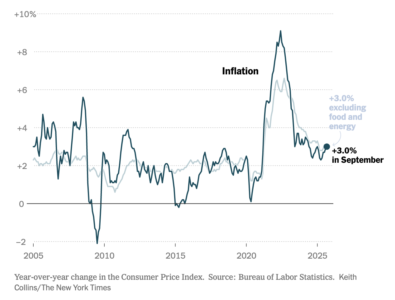
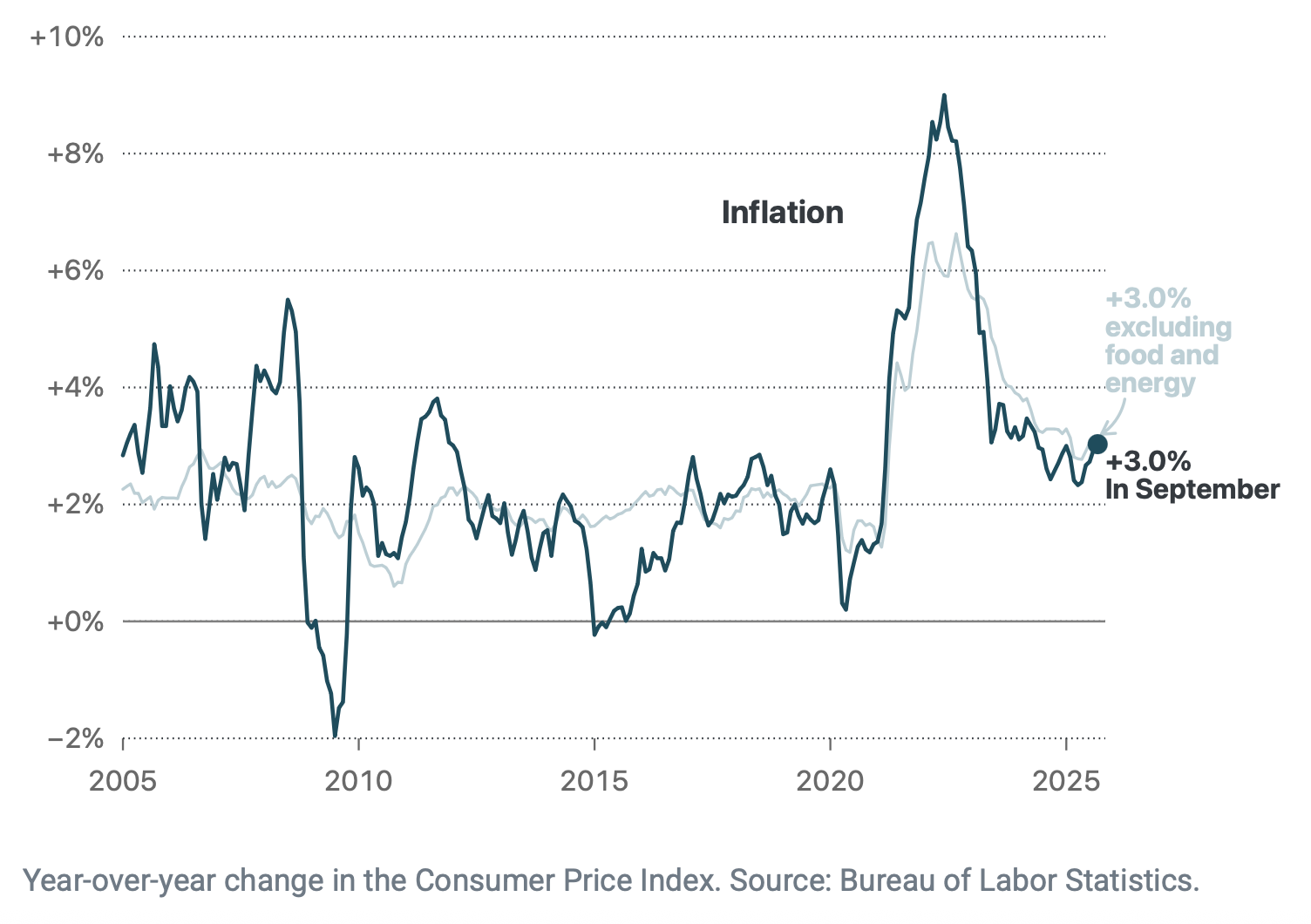
With not-too-much effort, I would say I was successful in reproducing a nearly identical plot. I was able to do this with without any special themes or templates. This is thanks to Observable’s simple syntax and default styles that look polished out of the box.
The next section details how I did this. Considering that I like to format my code vertically for improved readability, it still took less than 100 lines.
How I did this
First, I located data sets for Total CPI and CPI Minus Food and Energy from FRED. After downloading the data, I combined both series into a single csv and went ahead and calculated the year-over-year percentage change for each. That is what the plot actually shows.
The dataset is then imported into R using the readr package. I start with R here rather than Observable since this is an R-based Quarto site and I have found it to be the most straightforward workflow for importing data.
Then, the data frame is passed through ojs_define to convert to a JavaScript array.
# convert R data frame to Observable JavaScript (ojs)
CPI_Sheet1 = ojs_define(CPI_Sheet1)
Once the data is in the JavaScript environment, I now switch to Observable code. The array needs to be transposed to be structured like a standard data frame and the observation_date field needs to be converted to JS date format using new Date.
CPI = transpose(CPI_Sheet1)


// convert observation_date to date format
CPI1 = CPI.map(d => ({...d,
               ob_date: new Date(d.observation_date)}
               ))
Now, the fun part. Notice that the NYT plot has a dot denoting the last inflation observation in September 2025. In order to plot that dot, I need a separate array with a single object containing the coordinates for that dot.
This code extracts the last object in the data array using slice, defines an empty array, and then uses push to add that object to the array. This array can now be used in the later plot code.
dot = CPI1.slice(-1)[0]

// define empty array
lastDot = []

// push last object onto the array
lastDot.push(dot)
The plot itself consists of two Plot.lineY calls, one for each line. I used a color picker tool in my browser to get hex code approximations for the line stroke colors. Then, three Plot.text calls for the “Inflation” label and the two annotations for the final observation.
As mentioned earlier, Plot.dot was used with the lastDot array I defined to highlight the final observation as well. Plot.arrow made a simple curved arrow using custom-defined x and y coordinates for the start and end points–pretty simple!
Finally, Plot.axisX and Plot.axisY made quick work of mimicking the axes, including some d3 formatting calls to transform raw values into percents and years. Plot.gridY with a strokeDasharray argument set the dotted horizontal grid lines in the background.
// make the plot
Plot.plot({
  // set area around plot
  marginBottom: 60,
  marginLeft: 50,
  marginRight: 100,

  // set default styles and axis limits
  style: {fontSize: 14},
  y: {domain: [-0.02,.10]},
  x: {domain: [new Date("2005-01-01"), new Date("2025-10-30")]},
  caption: "Year-over-year change in the Consumer Price Index. Source: Bureau of Labor Statistics.",
  marks: [

  // drawing each custom axis
    Plot.axisX({
              interval: d3.timeYear.every(5), // ticks every 5 years
              tickFormat: d3.timeFormat("%Y"),
              tickPadding: 10,
              color: "#696969",
              label: "",
              labelArrow: false}),
    Plot.axisY({tickSize: 0,
                interval: 0.02,
                color: "#696969",
                label: "",
                labelArrow: false,
                tickFormat: d3.format('+.0%')}),

    // grid and y-axis ruler
    Plot.gridY({
      interval:.02,
      strokeDasharray: "0.75,2", // dashed
      strokeOpacity: 1 // opaque
    }),
    Plot.ruleY([0], {stroke: "gray", strokeWidth: 1.1}),

    // inflation lines
    Plot.lineY(CPI1.filter(d => d.ob_date >= new Date('2005-01-01')), {x: "ob_date",
      y: "yoyCPILFESL",
      opacity: 1,
      stroke: "#b9d0d6"}),
    Plot.lineY(CPI1.filter(d => d.ob_date >= new Date('2005-01-01')), {x: "ob_date",
      y: "yoyCPIAUCSL",
      stroke: "#024d5e",
      strokeWidth: 2}),

    // text annotations
    Plot.text([["2019-01-01", 0.07]], {text: ["Inflation"], fontWeight: "bold", fontSize: 16}),
    Plot.text([["2025-10-30", 0.025]], {
      text: ["+3.0%\nIn September"],
      fontWeight: "bold",
      fontSize: 14,
      textAnchor: "start"}),
    Plot.text([["2025-10-30", 0.048]], {
      text: ["+3.0%\nexcluding\nfood and\nenergy"],
      fontWeight: "bold",
      fontSize: 14,
      textAnchor: "start",
      fill: "#b9d0d6"}),

    // arrow pointing to last dot
    Plot.arrow(
      [ {x1: new Date("2026-03-30"),
          y1: 0.038,
          x2: new Date("2025-09-30"),
          y2: 0.032}
      ],
      {
        x1: "x1",
        y1: "y1",
        x2: "x2",
        y2: "y2",
        bend: true,        // makes arrow curved
        stroke: "#b9d0d6",    // for visibility
        headLength: 12     // optional: adjusts arrowhead size
      }
    ),

    // last dot
    Plot.dot(lastDot,{x: "ob_date", y: "yoyCPILFESL", fill: "#024d5e", r: 5} )
  ]
})
Coming from tools like ggplot and Plotly, I have been very impressed with how clean the final Observable products look in comparison and how straightforward the syntax is for most charting options.
Making the Chart Interactive
The static plot looks nice, but where Observable really shines is in quick development of small, interactive applications. This section details how I made a new interactive version of the NYT inflation chart as shown below. Adjust the date range of the data using the dropdown inputs and hover over the plot to reveal values for each observation.
Why this is better
- Date range inputs allow for comparing longer-term inflation trends
- Hover text reveals specific values for each observation
- Anchoring the pointer hover effect to both data series simultaneously allows comparison between series over time
How I did this
Each date range input comes from a Inputs.date call, with value defaults set to the date range window of the original static plot as a starting point. The min and max of the date input set the allowable dates than can be submitted. startDate has a min set to the oldest date in the dataset (defined later as minDate) and a max set to the newest date in the dataset (also defined later).
endDate has the same max, but I set the minimum to one year greater than the oldest date in the dataset because I couldn’t think of a reason why you would need to view a range less than 1 year.
viewof startDate = Inputs.date({label: "Start Date",
                                value: "2005-01-01",
                                min: minDate,
                                max: maxDate,
                                required: true})

// set an end date for the range
viewof endDate = Inputs.date({label: "End Date",
                              value: "2025-09-01",
                             min: '1948-01-01',
                             max: maxDate,
required: true})As mentioned before, these simple variable assignments pull out all of the dates in the CPI1 dataset and then set the oldest date to minDate and the newest date to maxDate.
dates = CPI1.map(d => d.ob_date)

// get minimum date
minDate = new Date(Math.min(...dates))

// get maximum date
maxDate = new Date(Math.max(...dates))
Our original data set is filtered based on the result of the startDate and endDate inputs. Because of the default values set earlier, this means that the data set is initially restricted to ‘2005-01-01’ and ‘2025-09-01’.
// filter the array based on the start date and end date inputs
cpiSheet1Filt = CPI1.filter(d => d.ob_date >= startDate && d.ob_date <= endDate)
The interactive plot is built with two Plot.lineX calls, just like the static plot earlier. However, this time the data being plotted is cpiSheet1Filt, which we just described above.
The two date range inputs also define the x domain–this sets the viewable x-axis on the plot. Because the x-axis can vary widely (date ranges from 1947 through 2025), I needed to set dynamic tick mark intervals. If this wasn’t done, then when the data is “zoomed out” the initial tick mark interval of 5 years will show overlapping tick marks and it will look cluttered. dynamicTick() is an if-else statement defined later that sets the tick mark intervals at various cut points depending on how many years are visible.
The y domain is also dynamic based on the minYBound and maxYBound variables (defined later). This is necessary because some time frames (’70s and ’80s) had much higher inflation than others (’90s). Hard-coding a domain to fit all of the values would cause the plotted lines to look very small in year ranges where inflation was low.
Interactive hover effects are achieved through three separate Plot.pointerX calls–two wrapped in a dot call and another wrapped in a ruleX call. The dots are anchored to each line series, following each line’s observations as the user moves along the x axis. Simultaneously, the vertical line (ruleX) tracks with the user’s mouse to visually line up with the x axis dates.
Finally, another Plot.pointerX call wrapped in a Plot.text call is anchored to the top-left of the plot to print out the date, total inflation, and inflation without food and energy series observations that the user’s mouse is hovering over. This particular implementation might look overwhelming at first, but I used the example on the fantastic Observable documentation as a base, and then modified for my needs.
// make the plot
Plot.plot({
  marginBottom: 60,
  marginLeft: 50,
  marginRight: 20,
  style: {fontSize: 14},

// dynamic axis ranges
  y: {domain: [minYBound, maxYBound]},
  x: {domain: [startDate, endDate]},
  caption: "Year-over-year change in the Consumer Price Index. Source: Bureau of Labor Statistics.",

  marks: [
  // axes
    Plot.axisX({
              ticks: dynamicTick(),
              tickPadding: 10,
              color: "#696969",
              label: "",
              labelArrow: false}),

    Plot.axisY({tickSize: 0,
                interval: 0.02,
                color: "#696969",
                label: "",
                labelArrow: false,
                tickFormat: d3.format('+.0%')}),

    // gridlines
    Plot.gridY({
      interval:.02,
      strokeDasharray: "0.75,2", // dashed
      strokeOpacity: 1 // opaque
    }),
    Plot.ruleY([0], {stroke: "gray", strokeWidth: 1.1}),

    // lines
    Plot.lineY(cpiSheet1Filt, {x: "ob_date",
      y: "yoyCPILFESL",
      opacity: 1,
      stroke: "#b9d0d6"}),
    Plot.lineY(cpiSheet1Filt, {x: "ob_date",
      y: "yoyCPIAUCSL",
      stroke: "#024d5e",
      strokeWidth: 2}),

   // interactions
    Plot.ruleX(cpiSheet1Filt, Plot.pointerX({x: "ob_date", py: "yoyCPIAUCSL", stroke: "red"})),
    Plot.dot(cpiSheet1Filt, Plot.pointerX({x: "ob_date", y: "yoyCPILFESL", stroke: "red"})),
    Plot.dot(cpiSheet1Filt, Plot.pointerX({x: "ob_date", y: "yoyCPIAUCSL", stroke: "red"})),

    Plot.text(cpiSheet1Filt, Plot.pointerX({px: "ob_date", py: "yoyCPIAUCSL", dy: -17, frameAnchor: "top-left", fontVariant: "tabular-nums", text: (d) => [`Date: ${Plot.formatIsoDate(d.ob_date)}`, `Total Inflation: ${d3.format('+.1%')(d.yoyCPIAUCSL)}`, `Excluding Food/Energy: ${d3.format('+.1%')(d.yoyCPILFESL)}`].join("   ")}))

                ]
  })
This last bit of code finds the maximum and minimum values for the dynamic y-axis boundaries I described earlier. Additionally, the dynamicTick function lays out a series of if-else statements based on the yearRange variable, which simply calculates the number of years visible in the filtered dataset we defined earlier. The output of this function provides the tick mark intervals of the plot.
maxValue = Math.max(
  //...cpiSheet1Filt.map(d => d.yoyCPILFESL),
  ...cpiSheet1Filt.map(d => d.yoyCPIAUCSL)
)

// find the minimum inflation value in the filtered array
minValue = Math.min(
  //...cpiSheet1Filt.map(d => d.yoyCPILFESL),
  ...cpiSheet1Filt.map(d => d.yoyCPIAUCSL)
)

// create variable for max y limit
maxYBound = Math.round((maxValue + .01) * 100) / 100

// create variable for min y limit
minYBound = Math.round((minValue - .01) * 100) / 100

// set tick marks based on date range
yearRange =  endDate.getUTCFullYear() - startDate.getUTCFullYear()

dynamicTick = () => {
  if (yearRange >= 20 && yearRange <= 50) {
    return "5 years";
  }
  else if (yearRange > 50) {
    return "10 years";
  }
  else if (yearRange >= 10 && yearRange < 20) {
    return "2 years";
  }
  else if (yearRange > 2 && yearRange < 10) {
    return "year";
  }
  else if (yearRange <= 2 && yearRange > 0) {
    return "3 months";
  }
  else {
    return "month";
}
}
Conclusion
In short, Observable rocks :)